I think most of us can agree there are generic logos in the world that we easily forget, and then there are great logos that we'll always be able to recognize (even without the brand's name attached).
But what is it about a logo that makes you recognize it? What is it about the design that can elicit a memory or even a specific emotion?
If you're in the process of creating a logo for your company, you're in a unique position to make a powerful impact on how consumers perceive your brand.
Everything you do, say, and, display as part of your new business will tell your prospects more about your company's identity. It's vital to ensure from the beginning that you present a cohesive and clear statement regarding your company's message.
And while a logo may seem quite simple to create, designing a great one isn't always easy. It involves a lot of market research, a deep knowledge of your buyer personas, and thoughtful consideration of the principles of logo design. Often, designers find themselves creating many iterations of a single logo before getting it "just right."
So, where do you even begin to design a logo? Right here. We've broken down the nine key steps (with a few tips thrown in) you'll need to take to create a logo that not only you love, but your prospects will too.
How to Design a Logo for Free
- Start With Your Story
- Brainstorm Words That Describe Your Brand
- Sketch Ideas Based on These Words
- Test Your Top Sketches With Your Buyer Persona
- Refine Your Chosen Sketch
- Develop Your Logo's Layout on a Free Design Platform
- Pick Versatile Color Options
- Choose a Font
- Ensure Scalability
How to Design a Business, Company, or Personal Logo
1. Start With Your Story
Companies are created to make money -- it's not the most poetic statement, but it's the one you need to start with. And in order to make a profitable business, you need to be able to sell yourself just as well as your product. Marketers today tend to agree that buyers connect much more strongly to stories than they do to the basic facts of your product. What does this mean to you? There needs to be some story in your logo.
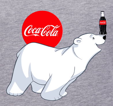
Before you even think about what this logo will look like, take some time asking yourself what the story behind your company is. When we look at Coca-Cola, we don't see a brown, carbonated beverage -- we see polar bears and thick, white script letters.
 Image via Coca-Cola
Step outside of what your company does and convey why you do it. That “why” is the root of your story, and it should come through in the color, shape, and typeface of your logo. If your logo were the title of a movie, what would it look like?
2. Brainstorm Words That Describe Your Brand
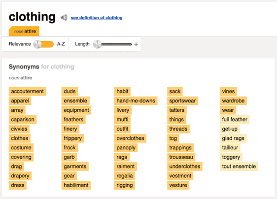
Now that you have your story, it's time to take your logo draft from story to setting. Open Thesaurus.com and enter a term that best describes your product into the search bar.
For example, if you're in the clothing industry, you might simply type in "clothing." You'd be surprised by how descriptive the synonyms are that appear. You can even click these results to start new searches and dig deeper as you zero in on the words that best capture your brand.
 Image via Thesaurus.com
Find five to 10 words that describe not only what you do, but the why from the previous step. Each of these words can fit like pieces in a puzzle and help guide you to refining a concept.
3. Sketch Ideas Based on These Words
Armed with your why and a few keywords for direction, grab a pencil and paper and start sketching every idea that comes into your head. Allow each new concept to evolve on its own. Don't get frustrated if the first few aren't right -- keep refining, using previous sketches to influence the outcome of new ones. You might focus these sketches on a shape, the name of your brand, or both.
As you're sketching the concepts for your logo, keep these tips in mind:
- Keep the shape simple. If you can sketch the most symbolic components in seven seconds or less, you're in good shape. You should absolutely avoid any popular clip-art artwork or generic symbols like a globe, star, or similar icons that people too easily identify from other places. These are easily forgotten at first glance. The more creative you are at this stage, the better your final logo. Your logo is what your consumers will remember the most. Be honest in this artwork.
- Colors can either be your best friend or your worst enemy. You need to include color with your logo, but be selective on which colors you use. Be mindful of current color trends already being used today and in your target market. As a general rule, don't choose more than three colors. Choose a color or group of colors that will make you stand out from your competition. But please, for the love of marketing, don't use the whole rainbow!
4. Test Your Top Sketches With Your Buyer Persona
Once you've got a handful of different sketches on paper, take a step back and pick the top three concepts. Don't think too hard about this -- consider the designs your eyes keep going back to, and select them to show to others.
Share these drafts with your friends, family members, and a colleague you trust. If possible, bring these sketches to someone who best fits your buyer persona -- or your ideal customer profile. This gives you the most productive opinion on your artwork because it can indicate how customers will receive your brand -- not just the people close to you.
Be prepared for honest feedback and don't take any negative comments personally. These criticisms will only make your final logo better. Use their feedback to select one final concept to develop into a design.
5. Refine Your Chosen Sketch
Congratulations, you're well on your way to having an awesome logo! Once you've identified a sketch to run with, it's time to refine it and perfect the story you started with in Step 1.
To begin refining your logo, look back at the terms you identified when you first used Thesaurus.com in Step 2. Now look at your chosen sketch and ask yourself: Which terms does this sketch not yet capture? Use them to develop your sketch further, and add back the traits you liked best about the designs you didn't end up choosing for refinement.
6. Develop Your Logo's Layout on a Free Design Platform
Now, it's time to get technical and turn your paper drawing into a usable digital format. To bring this design to life, you have many free design platforms available to recreate your sketch in digital format. Here are a few free solutions:
The platforms above can help you put your sketched logo in digital format, but bringing your concept to life for a business audience requires a bit of technical direction. One of the most important things to get right is the layout. Make sure all of your text and shapes are perfectly spaced and the logo itself is aligned with its surroundings.
Your logo doesn't have to be symmetrical, but it should be aligned in different contexts. Chances are, you will encounter situations when your logo sits against different vertical and horizontal borders, and it should appear even with these surroundings no matter how you might repurpose your logo and where you might publish it.
7. Pick Versatile Color Options
Your logo's color scheme might look great against the color of the canvas on which you designed it, but eventually, your logo will be placed on backgrounds whose colors you didn't start with.
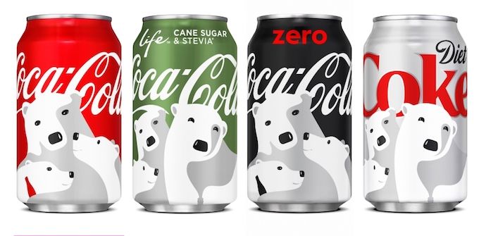
Let's revisit our Coca-Cola example from Step 1. As you can see below, the company's logo can work across any colored can it sells.
 Image by Jay Moye
Always be sure to have logo color variations for both dark and light backgrounds. That might mean only having to change the color of your font. Or, in some cases, you might have to change the color of your entire logo.
Create one of each option to make sure you're prepared when ordering promotional products that will display your logo. T-shirts, stickers, notepads, and coffee mugs are just a few of the many items for which you'll have different color variations of your logo.
8. Choose a Font
This is the time to combine text with imagery. If you're chosen sketch is primarily a shape or symbol, rather than text, begin to factor in the written name of your company. Consider the typeface this text will carry if your company name ever stands on its own without the symbol.
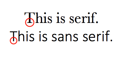
Believe it or not, your font choice can say a lot about your business. You can choose a font that's either serif (with stems on each letter) or sans serif (no stems) -- also known as classic or modern, respectively.

Stay away from generic fonts that come standard on every word processor. Some examples of generic fonts are Times New Roman, Lucida Handwriting, and Comic Sans. These fonts will only work against you and your company by making you less memorable.
9. Ensure Scalability
Logos are meant to represent your company on multiple platforms -- in print, on your website, on each of your social media business pages, and across the internet as your business grows. You want a logo that can be blown up super large for a billboard, but also scaled down for screening onto the side of a pen.
Every part of your logo should be legible, regardless of the logo's size.
Whew -- still with us? We know this might seem a little overwhelming, but take it slow and don't rush yourself. It's better to follow the process through to completion and end with a remarkable brand than to start over a few months later due to a design error or change of heart.
Once you've completed your logo, how can you tell if you scored a winner? Easy: Use our Logo Grader to assess the sustainability and effectiveness of your new logo.
Co-authored by: Rachel Begg, Julie Hruska, and Britt Schwartz
from Marketing https://ift.tt/2t49zT5
No comments:
Post a Comment